Above the fold is the part of your website a visitor sees without scrolling. It is the first impression, the handshake, and the moment someone decides whether to stay or leave. Most people decide within about five seconds. That is not a lot of time.
I have reviewed hundreds of small business websites over the years, and the ones that convert almost always nail these five things above the fold. The ones that do not usually have at least one of them wrong.
1. A clear headline that says what you do
Not your tagline. Not your company slogan. A plain statement of what you do and who you do it for. "Custom websites for small businesses" is clearer than "Elevating your digital presence." Visitors do not want to decode your headline. They want to confirm they are in the right place.
Write your headline so that someone who knows nothing about you can read it in two seconds and know exactly what you offer.
2. A subheadline that handles the "why you"
Your headline tells them what you do. Your subheadline tells them why it matters or what makes you different. This is two to three sentences at most. Focus on the outcome you deliver, not the process you use.
Instead of "I use a proven five-step methodology," try "Restaurants in the Tri-Cities area have doubled their online reservations after working with me." One of those is about you. The other is about what your client gets.
3. One clear call to action
Pick one. Not two, not three. One thing you want a visitor to do. Book a call, request a quote, view your work, whatever the right next step is for your business. Put it in a button with a verb. "Get a Free Quote" works. "Learn More" does not tell anyone what happens next.
Many small business websites have three or four buttons above the fold and the visitor just gets confused. Give them one clear option and they are much more likely to take it.
4. A visual that builds trust
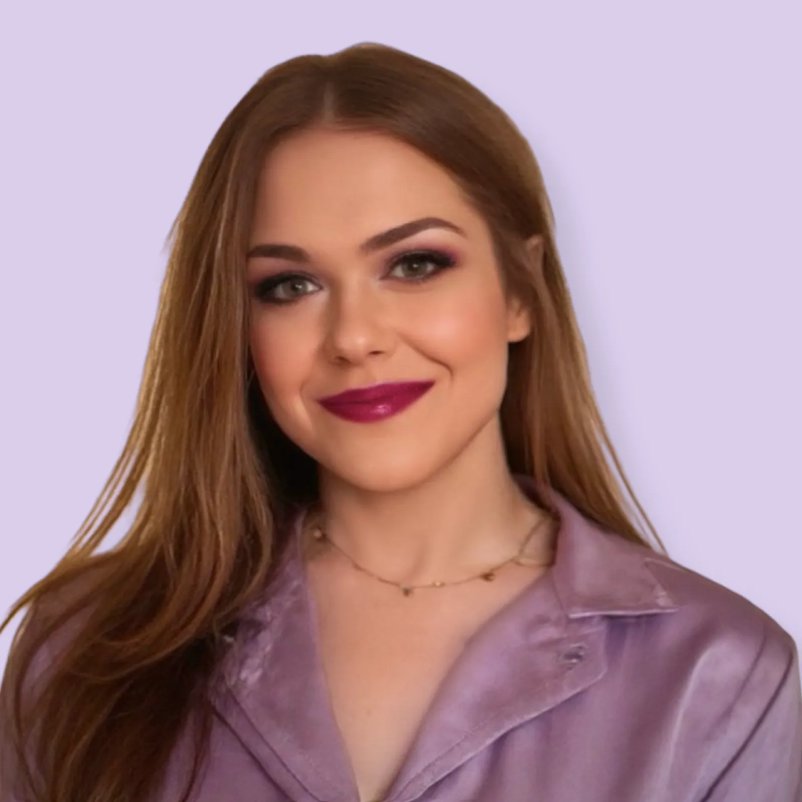
This could be a professional photo of you, a photo of your work, or a polished graphic. It should look intentional, not like a stock photo of someone in a hard hat shaking hands. People buy from people. A real photo of you or your work does more for conversion than any graphic.
If you do not have professional photos yet, that is okay. A clean, well-designed page with no photo is better than a page with a generic stock photo that makes you look like a corporation.
5. A signal that you are credible
This might be a client logo, a review snippet, a certification badge, a publication you have been featured in, or a simple stat like "serving the Tri-Cities for 10 years." Something that answers the question every visitor is quietly asking: "Can I trust this person?"
You do not need an awards wall. One or two well-placed trust signals above the fold can significantly increase how long people stay on your site.
Not sure how your site stacks up? I offer web design packages that are built around all of these principles from the ground up.
See Web Design Packages